| 💚 Activity Rings & Energy |
| ActivitySummary.csv | Daily | Daily totals and progress toward Move, Exercise, and Stand ring goals. One row per day — the best starting point for long-term activity trend analysis and ring-close streaks. |
| HKQuantityTypeIdentifierActiveEnergyBurned.csv | ~1 min | Active (non-resting) calories burned. Drives the Move ring. Sampled more frequently during workouts; otherwise accumulated over short rolling windows. |
| HKQuantityTypeIdentifierBasalEnergyBurned.csv | Daily | Resting metabolic rate — calories your body burns at rest, estimated from height, weight, age, and heart rate. Typically represents 60–75% of total daily energy expenditure. |
| HKQuantityTypeIdentifierAppleExerciseTime.csv | ~1 min | Minutes of activity meeting Apple's "brisk activity" threshold (roughly equivalent to a fast walk, ~3 METs). Drives the Exercise ring. Does not require a logged workout. |
| HKQuantityTypeIdentifierAppleStandTime.csv | Hourly | Total minutes spent standing within each hour. Distinct from the binary stand-hour flag below — this gives duration, not just a yes/no. |
| HKCategoryTypeIdentifierAppleStandHour.csv | Hourly | Binary flag (stood / did not stand) for each hour. Drives the Stand ring goal of 12 hours per day. More interpretable than stand time for streak and compliance analysis. |
| HKQuantityTypeIdentifierPhysicalEffort.csv | ~1 min | Estimated metabolic equivalent (MET) of current activity — a dimensionless intensity scale where 1.0 = resting. Useful for computing exercise load across varied activity types. |
| HKQuantityTypeIdentifierTimeInDaylight.csv | Daily | Cumulative daily time spent in sunlight ≥1,000 lux, detected by the Watch's ambient light sensor. Relevant for circadian rhythm research and myopia prevention studies. |
| 🏃 Movement & Distance |
| HKQuantityTypeIdentifierStepCount.csv | ~1 min | Raw step count from the accelerometer. One of the highest-volume files. Both iPhone and Watch contribute separate records — filter by sourceName or sum carefully to avoid double-counting. |
| HKQuantityTypeIdentifierDistanceWalkingRunning.csv | ~1 min | Distance covered on foot in meters. Same dual-source caution as StepCount — iPhone and Watch both log this independently. |
| HKQuantityTypeIdentifierDistanceCycling.csv | Per Workout | Distance cycled in meters. Populated during logged cycling workouts; GPS-based when available, otherwise estimated from speed sensors or cadence. |
| HKQuantityTypeIdentifierDistanceSwimming.csv | Per Workout | Distance swum in meters. Pool swimming uses accelerometer-based lap counting; outdoor swimming uses GPS on capable models. |
| HKQuantityTypeIdentifierFlightsClimbed.csv | Event-based | Number of flights of stairs climbed, detected by the barometric altimeter combined with accelerometer motion. One "flight" ≈ 3 meters of elevation gain while ascending. |
| 🚶 Walking & Gait Health |
| HKQuantityTypeIdentifierWalkingSpeed.csv | ~1 min | Average walking speed (m/s) during level-ground walking. Clinically relevant — slower speeds are associated with aging, fatigue, and fall risk. One of Apple's "mobility metrics" (Series 4+). |
| HKQuantityTypeIdentifierWalkingStepLength.csv | ~1 min | Average distance per step while walking (meters). Declines with age, fatigue, or neurological changes. Combined with cadence, it determines walking speed. |
| HKQuantityTypeIdentifierWalkingAsymmetryPercentage.csv | ~1 min | Difference in timing between left and right steps (%). Higher asymmetry can signal injury, pain-avoidance gait, or neurological changes. Healthy range is typically under 10–15%. |
| HKQuantityTypeIdentifierWalkingDoubleSupportPercentage.csv | ~1 min | Percentage of the gait cycle when both feet are on the ground simultaneously. Higher values indicate more cautious or unstable walking; increases with age and balance impairment. |
| HKQuantityTypeIdentifierStairAscentSpeed.csv | Event-based | Speed going up stairs (m/s), measured via accelerometer and altimeter. A strong predictor of cardiovascular fitness and lower-body strength in older adults. |
| HKQuantityTypeIdentifierStairDescentSpeed.csv | Event-based | Speed going down stairs (m/s). Demands more of balance and eccentric muscle control than ascent; particularly sensitive to joint health and fall risk. |
| HKQuantityTypeIdentifierAppleWalkingSteadiness.csv | Daily | Composite fall-risk score derived from the gait metrics above (speed, double support, asymmetry). Rated OK / Low / Very Low. Lower scores indicate higher fall risk. Requires Apple Watch Series 4+. |
| HKQuantityTypeIdentifierSixMinuteWalkTestDistance.csv | On-demand | Estimated distance (meters) you could cover in 6 minutes at your sustainable walking pace — a standard clinical cardiorespiratory fitness benchmark. Calculated passively from walking data; no formal test required. |
| ❤️ Heart & Cardiovascular |
| HKQuantityTypeIdentifierHeartRate.csv | ~5 min | Heart rate in BPM from the optical sensor (PPG). Background rate ~every 5 min at rest; continuous during workouts. Typically the largest file in the export by row count. |
| HKQuantityTypeIdentifierRestingHeartRate.csv | Daily | Apple's daily resting heart rate estimate — the lowest stable HR recorded during quiet wakefulness. A strong long-term cardiovascular fitness and recovery indicator. |
| HKQuantityTypeIdentifierWalkingHeartRateAverage.csv | Daily | Average heart rate during level-ground walking at a normal pace. A stable fitness proxy less affected by same-night sleep quality than resting HR. |
| HKQuantityTypeIdentifierHeartRateVariabilitySDNN.csv | Nightly | HRV measured as SDNN (standard deviation of beat-to-beat intervals) from overnight wrist-PPG readings. Reflects autonomic nervous system balance. Higher is generally better; highly individual — always track your own trend, not population norms. |
| HKQuantityTypeIdentifierHeartRateRecoveryOneMinute.csv | Per Workout | Heart rate drop in the first minute after a workout ends (BPM). A drop of <12 BPM is clinically considered abnormal. Strong predictor of cardiovascular fitness and autonomic recovery. |
| HKQuantityTypeIdentifierAtrialFibrillationBurden.csv | Daily | Percentage of time in atrial fibrillation per day. Requires Apple Watch Series 4+ with ECG capability and the AFib History feature enabled. Only populated for users with a prior AFib diagnosis. |
| HKCategoryTypeIdentifierIrregularHeartRhythmEvent.csv | Event-based | Timestamps when the Watch's background rhythm algorithm detected a possible irregular heartbeat (possible AFib). Each record is a notification event, not a confirmed diagnosis. |
| HKCategoryTypeIdentifierLowHeartRateEvent.csv | Event-based | Timestamps when resting heart rate dropped below the user's configured threshold (default 40 BPM) for at least 10 consecutive minutes while inactive. |
| 🫁 Respiratory & Blood Oxygen |
| HKQuantityTypeIdentifierRespiratoryRate.csv | Nightly | Breathing rate (breaths/min) estimated from subtle wrist movement during sleep. Normal resting range: 12–20 breaths/min. Elevated rates can be an early illness signal. |
| HKQuantityTypeIdentifierOxygenSaturation.csv | Nightly | Blood oxygen saturation (SpO₂ %) measured by the optical sensor. Background measurements during sleep (Series 6+); on-demand readings available anytime. Normal range: 95–100%. |
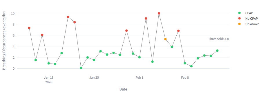
| HKQuantityTypeIdentifierAppleSleepingBreathingDisturbances.csv | Nightly | Count of breathing irregularities per hour of sleep, detected via accelerometer and respiratory algorithms. Used to flag potential sleep apnea risk. Requires Apple Watch Series 9 or Ultra 2 (watchOS 11+). |
| 😴 Sleep |
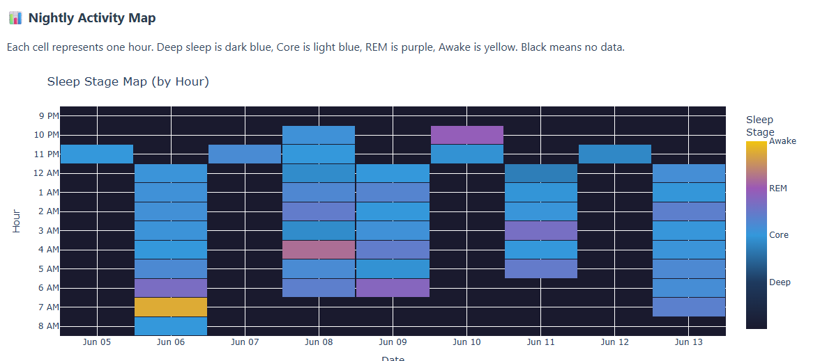
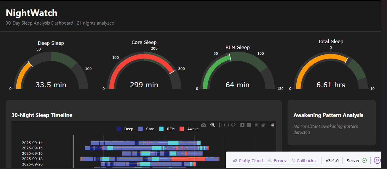
| HKCategoryTypeIdentifierSleepAnalysis.csv | Nightly | The primary sleep file. Continuous records with start/end timestamps and stage: Awake, REM, Core (Light), and Deep. Both iPhone-estimated and Watch-estimated rows may appear — filter by sourceName. One of the richest files for analysis. |
| HKQuantityTypeIdentifierAppleSleepingWristTemperature.csv | Nightly | Wrist skin temperature deviation (°C) from your personal nightly baseline. Negative = cooler than baseline, positive = warmer. Useful for detecting fever onset, alcohol effects, and menstrual cycle tracking. Requires Series 8+. |
| HKDataTypeSleepDurationGoal.csv | Static | User's configured nightly sleep duration target (hours). Changes rarely; useful as context when computing sleep debt or goal adherence over time. |
| 🏋️ Workouts |
| Workout.csv | Per Workout | Master log of every logged workout session: type (run, swim, yoga, strength, etc.), start/end timestamps, total duration, distance, and energy burned. Join with WorkoutStatistics for per-metric breakdowns. |
| WorkoutStatistics.csv | Per Workout | Metric summaries for each workout: average and peak heart rate, speed, cadence, etc. One row per metric per workout. Links to Workout.csv via workout UUID. |
| 🫀 Cardiorespiratory Fitness |
| HKQuantityTypeIdentifierVO2Max.csv | Weekly | Estimated maximum oxygen uptake (mL/kg/min) — the gold-standard measure of aerobic fitness. Apple calculates this after outdoor walks or runs using heart rate and GPS speed. Updates approximately weekly when outdoor activity occurs. |
| 🩺 Body Measurements |
| HKQuantityTypeIdentifierBodyMass.csv | On-demand | Body weight in kg or lbs, logged manually or via a connected smart scale. Only present if you've tracked weight in the Health app or a connected app. |
| HKQuantityTypeIdentifierHeight.csv | Static | User height from the Health profile. Rarely changes but is used internally for many derived calculations — stride length, VO₂ Max, and basal energy estimates all reference this value. |
| HKQuantityTypeIdentifierBloodGlucose.csv | On-demand | Blood glucose in mg/dL or mmol/L, logged manually or via a connected continuous glucose monitor (CGM). Typically only populated if you actively track glucose. |
| 🍵 Nutrition & Lifestyle |
| HKQuantityTypeIdentifierDietaryCaffeine.csv | On-demand | Caffeine intake in milligrams, logged manually or via a third-party app (e.g., Coffee Zap, Caffeine Tracker). Each entry reflects a single consumption event. |
| HKQuantityTypeIdentifierDietaryWater.csv | On-demand | Water intake in mL or fl oz, logged manually or via a hydration tracking app. Only present if you actively track water consumption. |
| HKCategoryTypeIdentifierHandwashingEvent.csv | Event-based | Timestamps of detected handwashing events, identified by motion (wrist movement) combined with sound (water running). Each record includes duration. Requires Apple Watch Series 6 or later. |
| 🔊 Audio & Environment |
| HKQuantityTypeIdentifierEnvironmentalAudioExposure.csv | ~1 min | Ambient noise level (dBA) measured by the Watch microphone. Continuous background monitoring. Levels above 80 dBA sustained for hours carry hearing risk. Useful for occupational noise exposure research. |
| HKQuantityTypeIdentifierHeadphoneAudioExposure.csv | Event-based | Audio level (dBA) delivered through connected headphones during use. WHO safe-listening guideline: <75 dBA time-weighted average per week. |
| HKCategoryTypeIdentifierAudioExposureEvent.csv | Event-based | Timestamps when headphone audio exceeded Apple's safe-listening threshold. Complements HeadphoneAudioExposure with discrete notification events rather than continuous level readings. |
| HKQuantityTypeIdentifierEnvironmentalSoundReduction.csv | Event-based | Amount of sound (dB) actively cancelled by AirPods in Active Noise Cancellation mode. Only populated when ANC-capable AirPods are connected and noise cancellation is enabled. |